Case study
Feek app
Type
IOS and Android app
Time
2 months
Role
Product Designer
Let me INTRODUCE you to Feek
Introduction
This is Feek

Feek is a nearly two-year-old app that provides users with discounts, perks, and special offers in exchange for posting stories on Instagram to promote businesses. It also features a rewards system where users can exchange accumulated points for items and experiences.
Problem Statement
What's the problem?
Users often become lost in the campaign validation process, leading them to abandon or incomplete the procedure. This results in user stress and frustration, decreasing client satisfaction and ultimately impacting the app’s growth and partnership opportunities with businesses.
Users get lost through the process.
Increase in abandonment and frustration rates.
Negative repercutions on the app's growth.
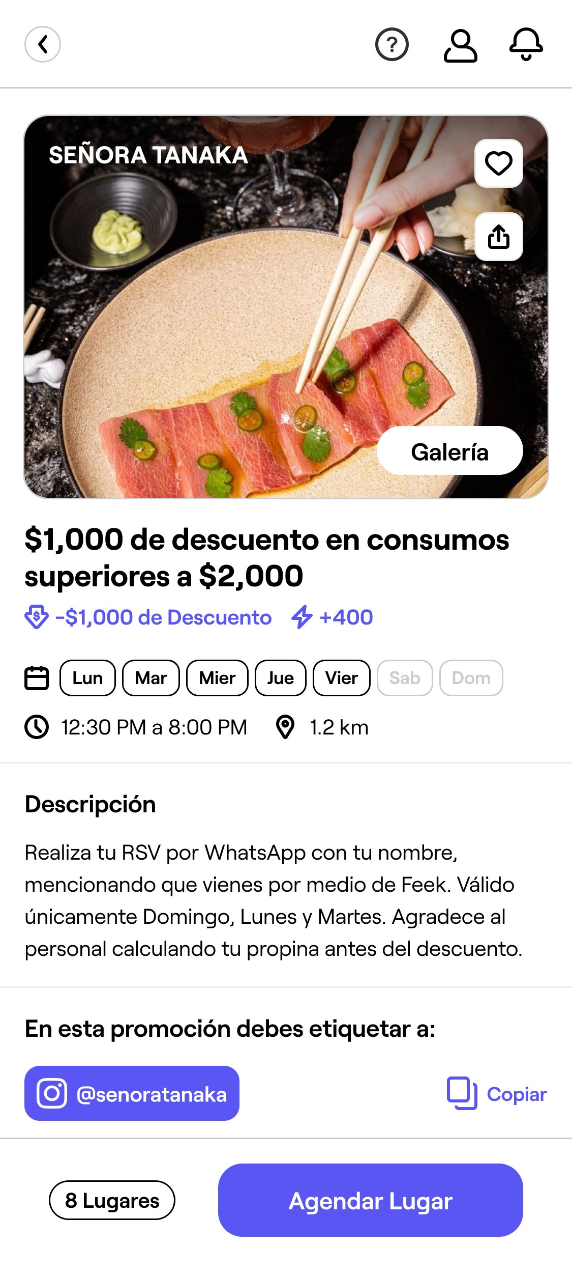
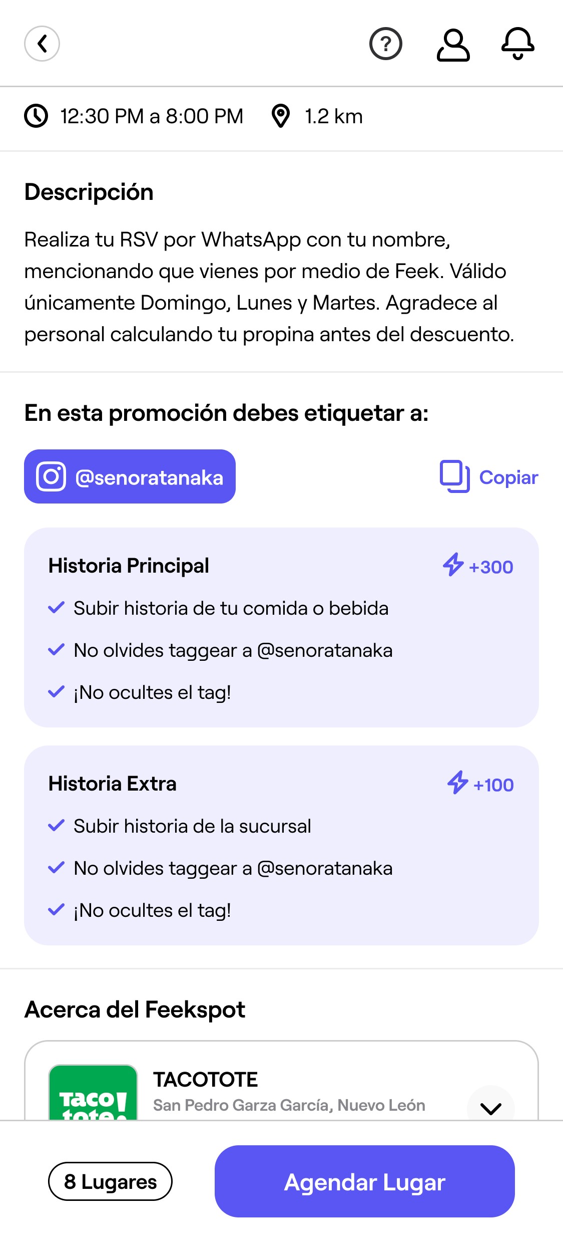
How might we redesign this experience so users enjoy it and flow naturally through it?
Objectives
Let's set some goals.
SIMPLIFY the validation process.
Redesign the campaign validation process to make it more intuitive, reducing user confusion and improving navigation.
INCREASE the completion rates.
Achieve a considerable increase in the number of users who complete the validation process.
REDUCE user frustration.
Decrease the number of users reporting frustration with the validation process through user-friendly design improvements.
Now, let's UNDERSTAND the users
Research Process - User Personas
Who are we designing for?.

THE GEEK.
20 - 27 years old users who are up to date in technology. They never struggle and enjoy the addition of new features. The first ones to tell you when something is wrong with the app

KEVIN & KAREN.
Middle-aged users who usually struggle navigating through the app and tend to complain a lot when something doesn't work the way they want to. Beware or they might call the manager.

IDK.
Users who use the app more casually and generaly don't have issues, when they do they tend to solve it by themselves. This users are here just for the bennefits, they don't care anything else.
Research Process - Surveys
About our users?.
Users were asked several questions to gather quantitative information about their behavior during the validation process.
This method provided data that clarified the scale of the problem. Additionally, the collected information helped us better understand the users and their behavior.
+54%
of users are 32 - 45 years old
56.5%
of users are women
+39.2%
of users have completed more than 5 campaigns
+47.2%
have left the process unfinished at least once
Research Process - Interviews
How do our users actually feel?.
We got in touch with our users in a more intimate way to find out how they really feel when navigating through this process.
Have you ever felt lost during the campaign validation process?
“Pretty much, I don’t know if it’s my age but I really don’t understand how it works”
"Yes, well now I’m more familiar with it but the first time I used it It took me a long time to go through the whole process”
“Just the first time, after that I got the hang of it”
“Last time I received a notification because I didn’t uploaded my ticket, I didn’t even know I had to do that”
Has this issue ever made you hesitant to use the app?
“I wouldn't say hesitant but it's definitely evoqued some insecurities”
"Yes, sometimes I find it annoying when I get lost in any app, this one makes no difference”
“Now that you say so, I think I stopped using it unconsciously for a period of time”
“Deffinitely, I hate that I can't clearly determine what the next step is. You should make it more clear. I know I'm not the only one struggling with this”
User Flow - Validation Process
Which path do they follow?
There used to be disconnection between 2 crucial parts of the validation process.
The main issue is that the time gaps between different parts of the process create confusion for users, due to a lack of clear information on when the "completion process" begins.
Scheme of previous User Flow
RESERVATION
PROMOTION COMPLETION
TIME & SPACE GAP
The user moves to designated location
Previous User Flow
Previous Validation Design
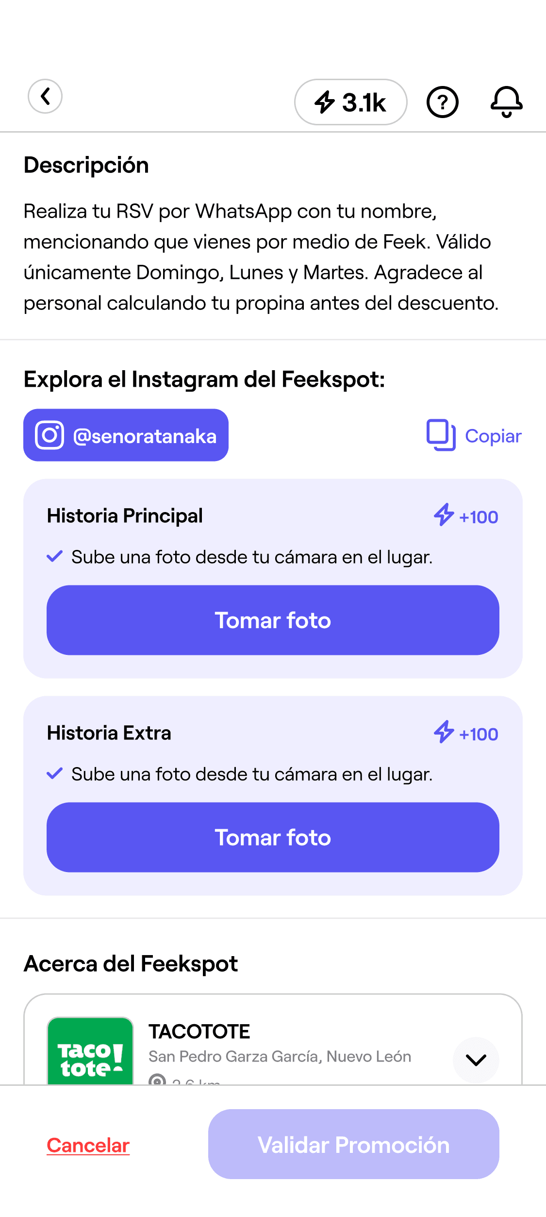
User must go through all this
Reservation.


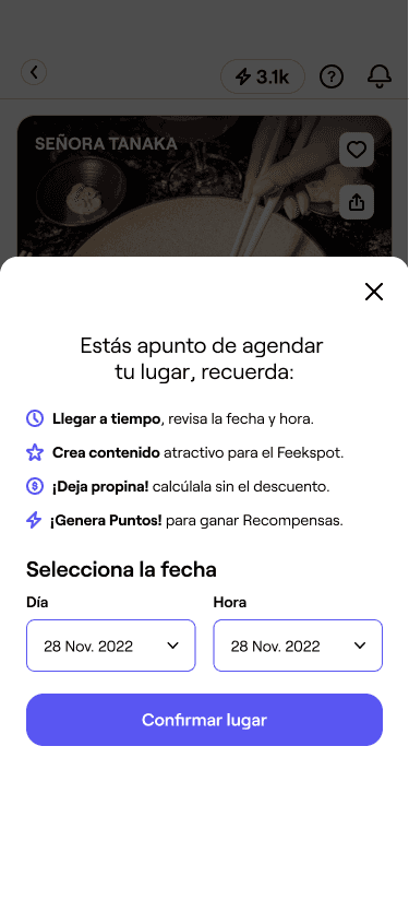
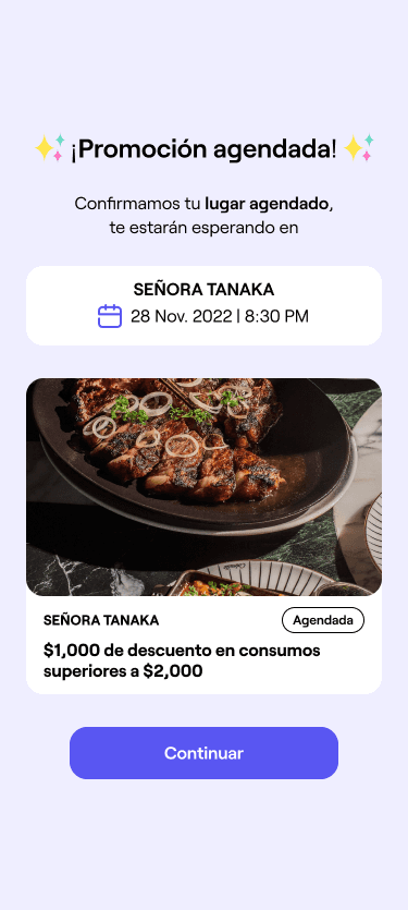
The time gap
Promotion Completion.
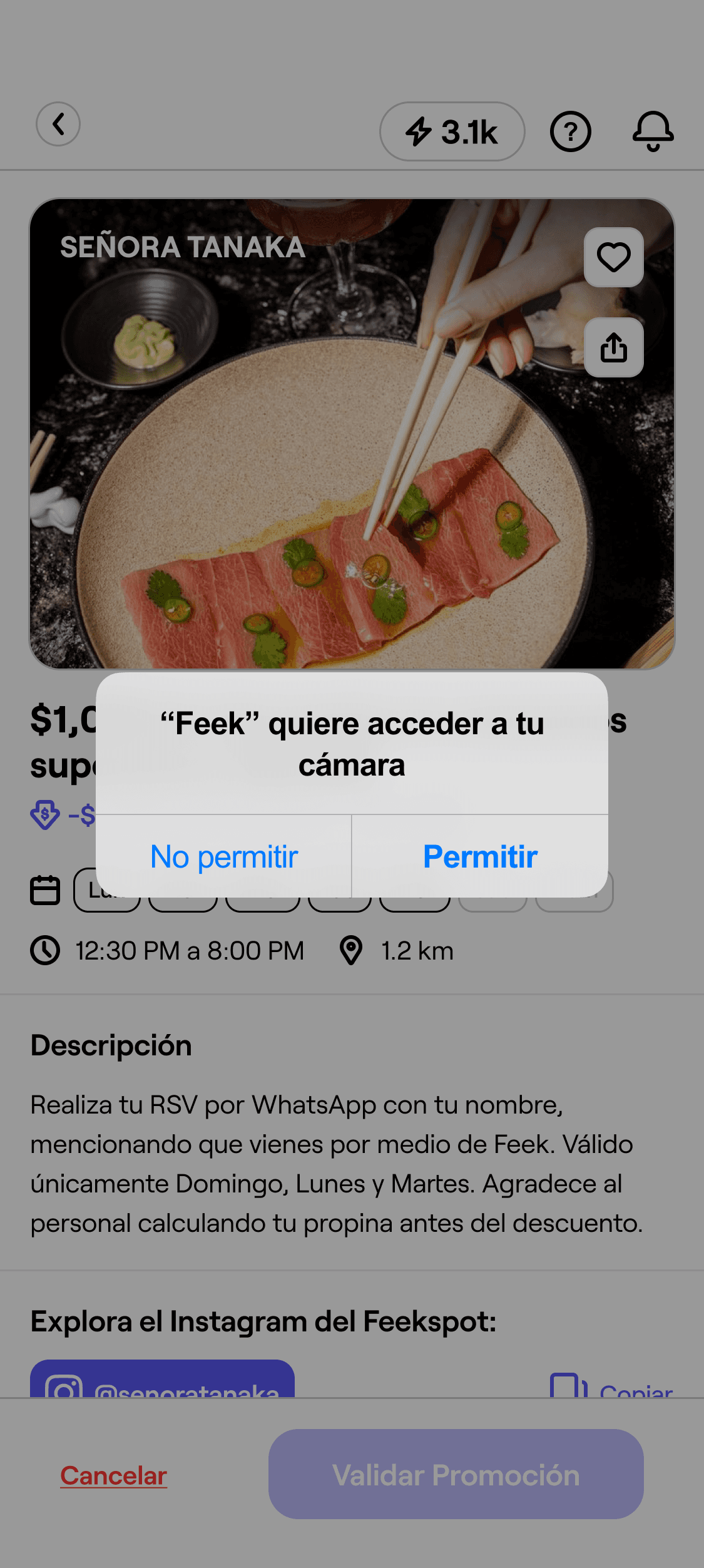
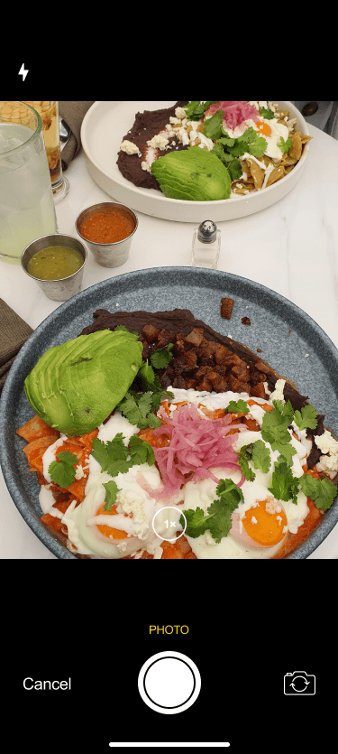
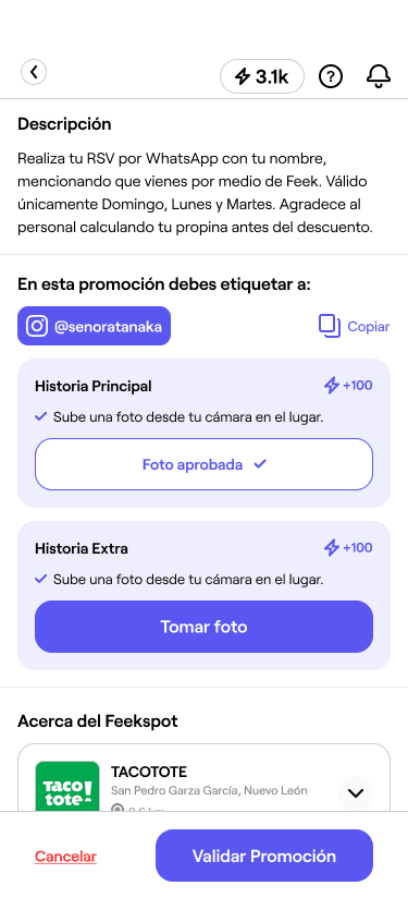
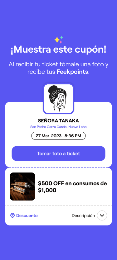
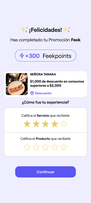
Research shows that this process is confusing for users due to a lack of clear continuity and disconnection between its different steps.
Let's solve the problem THROUGH DESIGN!
New User Flow
Redesign of the user flow
This new user flow addresses the problem by streamlining the overall process, minimizing decision-making, and providing a clear path for users to follow to completion.
After

Design Proposal
Early stages - How did we approach the solution?
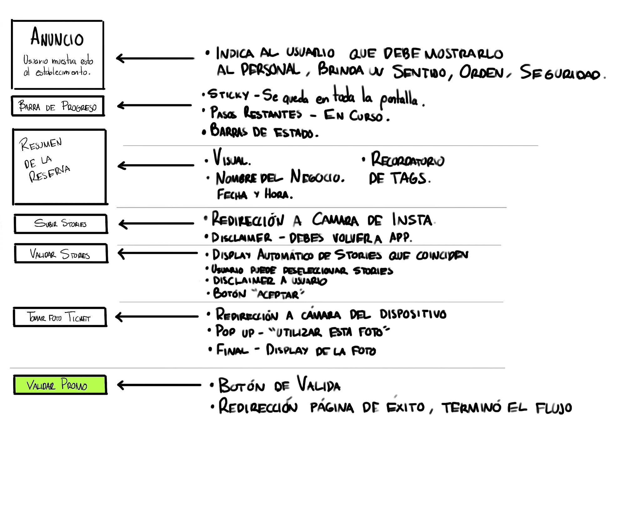
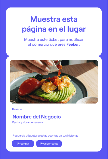
We approached the design solution in a modular way, ensuring everything is contained on the same page to guarantee continuity. We also structured the process so that users unlock the next step as they complete the previous one.
First Designs - Different iterations
Designing the modules
This section displays the early design stages of the various modules. These modules were identified as essential for the entire validation process.
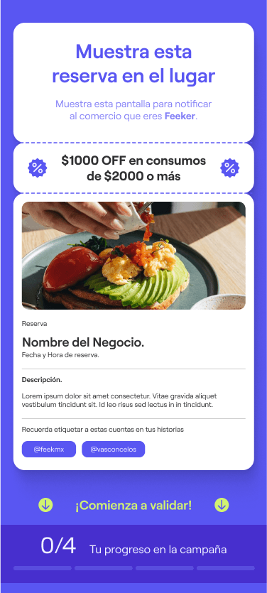
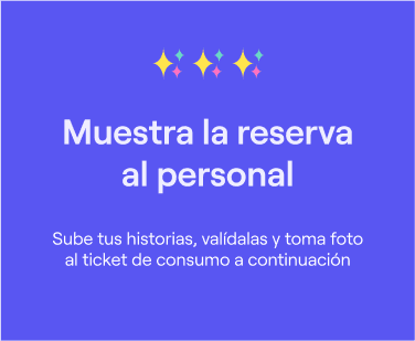
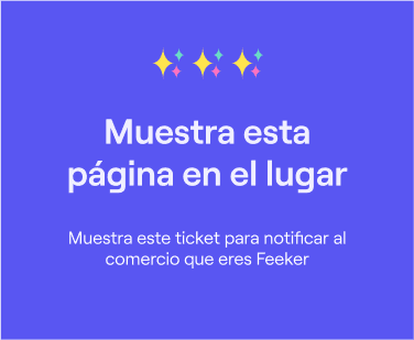
Reservation confirmation.
The user must show this when arriving to the designated store or restaurant.

Status bar.
It shows users their progress through the process.


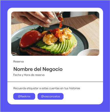
Summary.
It gathers all the specifics about the reservation.
First Designs - Different iterations
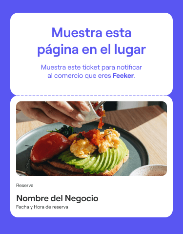
First module assembly
By this point, most of the modules had been designed, but the overall page assembly was unconvincing and lacked character.
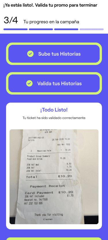
Let's see the RESULTS
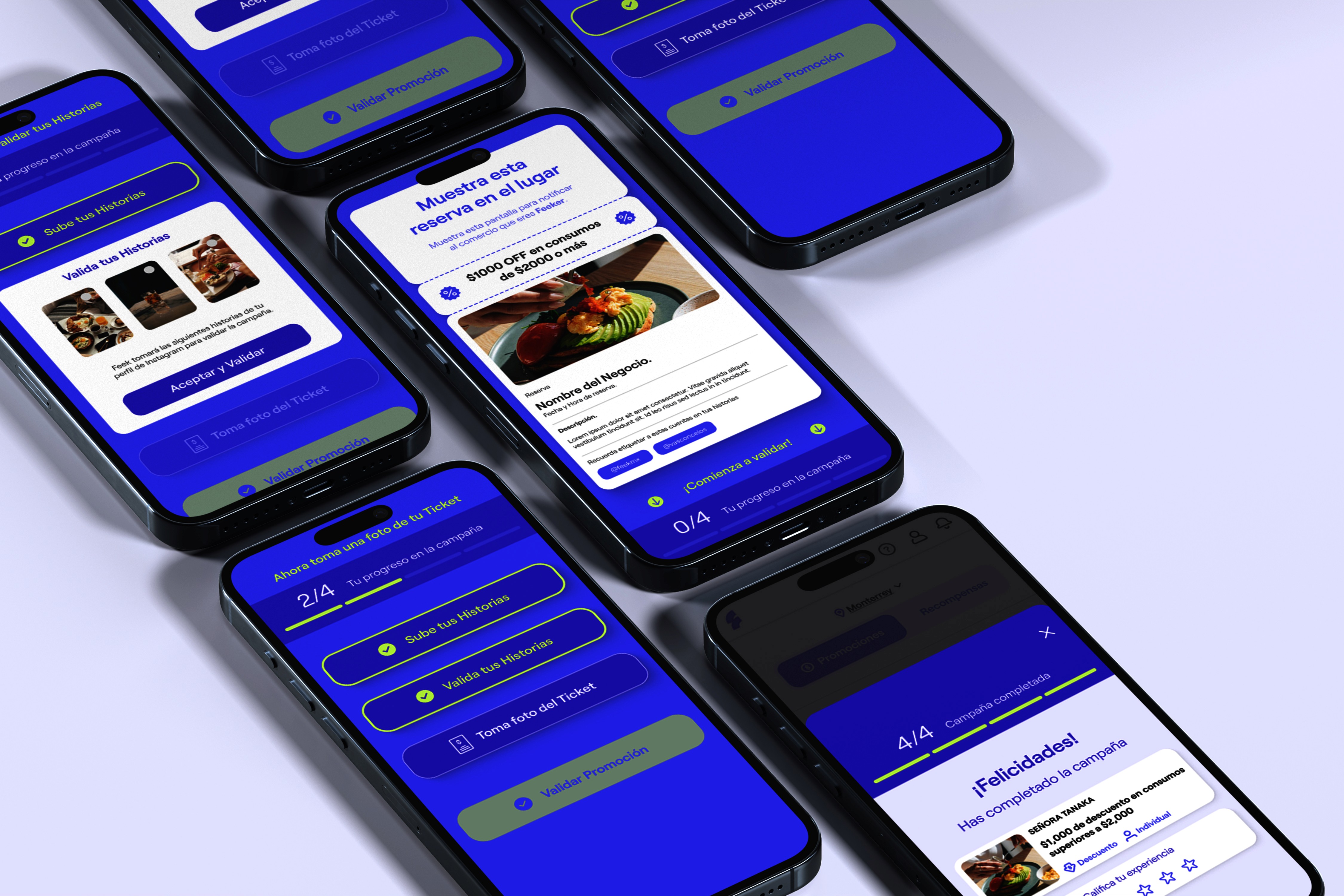
Final Designs
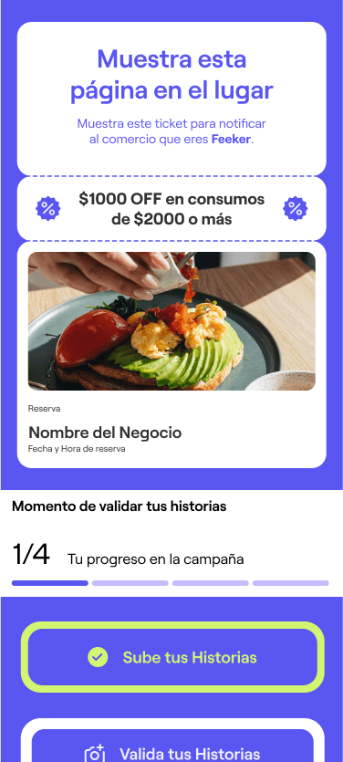
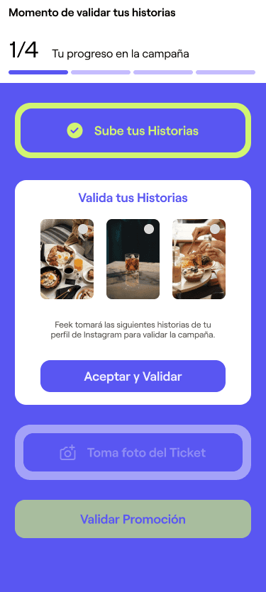
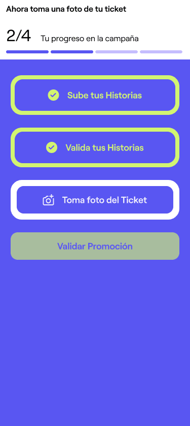
Final module assembly
This is the finished design after researching, doing iterations and tweaking the visuals to adjust to the pre-existing design guidelines.
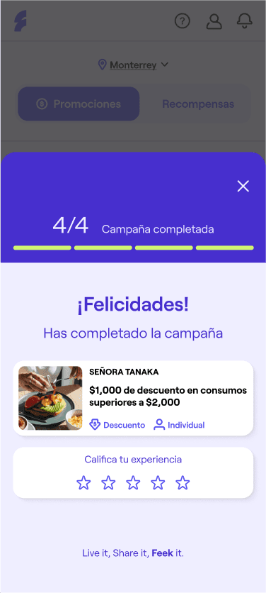
Final Designs
Design details
This is a brief explanation of the design's sections and their purpose.
Starting point.
Tells the user in a concise way what to do.
Reservation Summary.
Gives the user easy access to the most relevant information.
Action buttons.
Clarify the path the user must follow, the user does't have to leave the page nor the app to finish the process. Each button unlocks the next one once the task is completed.
Promotion.
Reminder for the user
Reinforcement.
Gives a brief instruction everytime an action is completed to ease user's experience.
Defined steps.
Every single special action needed for the process completion now can be done within the same page on the app.
Final Designs
Complementary Design
Additions to the app's homepage had to be made with the objective of connecting both extremes of the process. The reservation and the completion.
Ongoing Reservations.
This provides the user with easy access to the reservation either to be modified or to continue the process once at the place.
Always at the top.
Indicator so the users remember and have acces to the reservation whenever they enter the app.
FINAL THOUGHTS
Final Thoughts
Current state of the project
The project's been approved and is currently under development to be launched and tested on the app.
To sum up.
The objective of this redesign was to improve the app's UX. Users were getting lost in the most important flow of the app, which negatively impacted overall performance and growth.
The campaign validation flow was restructured with the user in mind, consolidating smaller steps into larger ones within the same space. This clear, cohesive route ensures users know what to expect at each step. Additionally, tweaks and enhancements were made to the homepage to improve accessibility and further reinforce the overall experience.
THANK YOU!

